How To Pick A Palette with Julie Snidle
We’re kicking off a “how to” series with a guest blog by R&F Core Instructor Julie Snidle. Julie has been working with wax-based media since 2004. An artist with both classroom teaching experience and a corporate training background, Julie has taught at Penland School of Craft and teaches workshops nationwide. Her work has received numerous awards and can be found in private collections and public spaces.
Julie is an Artist Ambassador for Ampersand Art Panels and is represented by Kolman and Reeb Gallery in Minneapolis, MN, which recently awarded her a grant for their Project Space in 2022.
Enjoy Julie’s thoughts on color and how she fine tunes her color palette below.
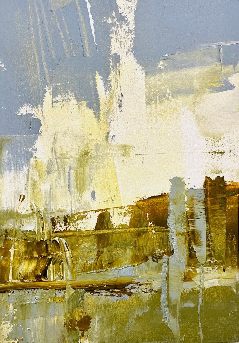
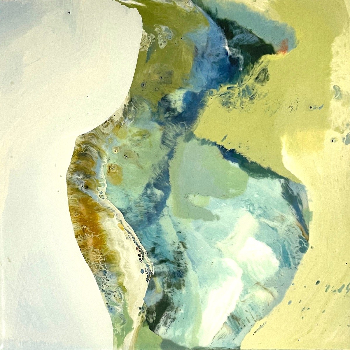
For my painting Old Faithful, I used Cobalt Blue, Green Gold, Alizarin Orange, and Titanium White.
I love color. Like many artists, color is what drew me to art in the first place. When I’m between projects in my studio, I enjoy mixing different color combinations, maybe two or three at a time, to see what happens and keep a record of the results.
Adding white to create tints and then discovering the range of neutrals that emerge is very exciting. The possibilities available to us are exponential. Since my paintings are created from memory and/or feelings about a place, my palette will vary according to the mood I want to create.
The color choices I make come either from previous experience with those colors or from color combinations I would like to explore further. I use my camera to collect color vignettes that inspire me. Below are three examples.
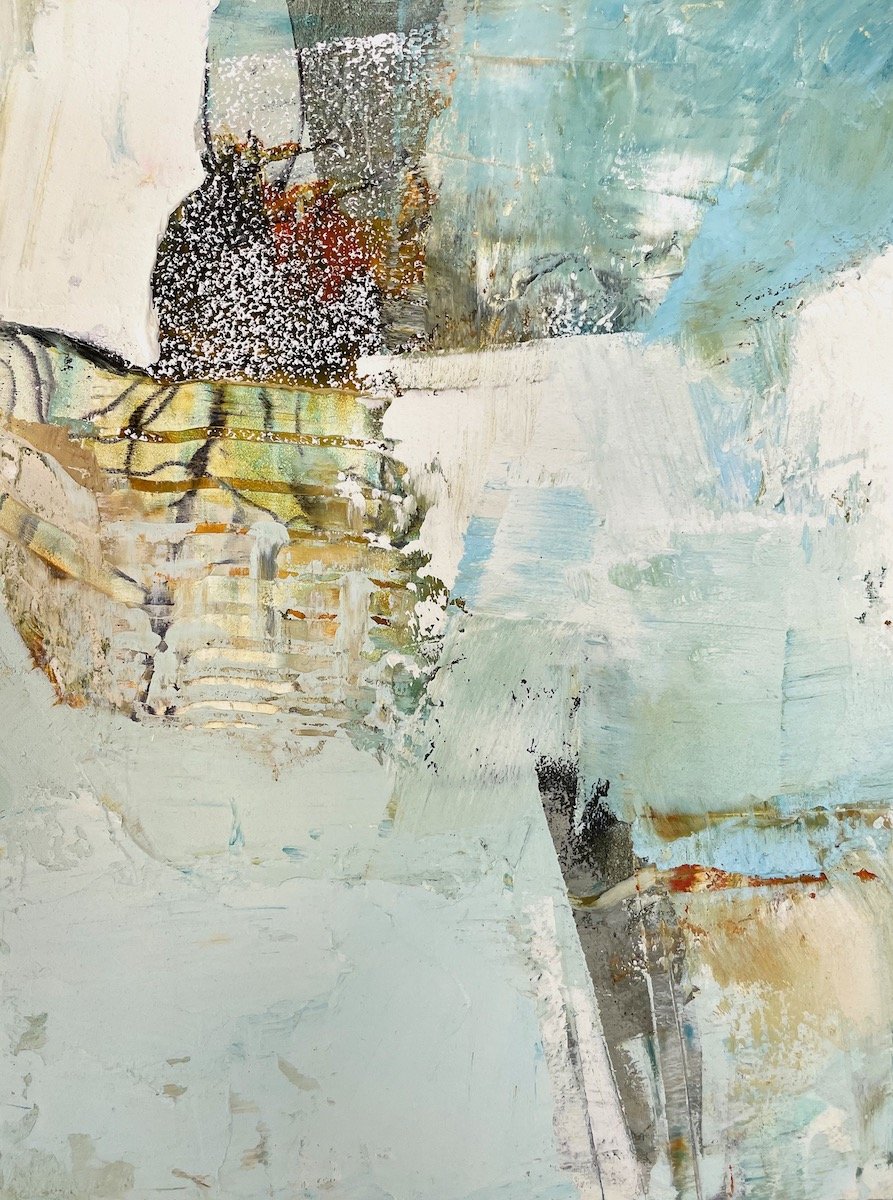
Can you guess which of the color vignettes above inspired my painting Bennington?
Julie Snidle, Bennington, 12” x 9”, oil and cold wax on panel.
I’m not referring to the subject matter of beach glass or shells or macaroons, I’m responding to the combination of colors that catch my eye and inspire me to paint. The very act of noticing, focusing, and snapping a photo connects us to these moments. Over time our photo collection tells us a great deal about our preferences, whatever they may be.
I don’t feel bound to any particular palette. I have many favorites. And since I don’t have a preconceived idea about what the finished painting will look like, color decisions are often made as the painting progresses. I’ll add a darker value or a warmer hue if the painting calls for it. Sometimes black is too strong for my lighter paintings so I turn to Turkey Umber Greenish, Graphite Grey, Prussian Blue, or Indigo instead.
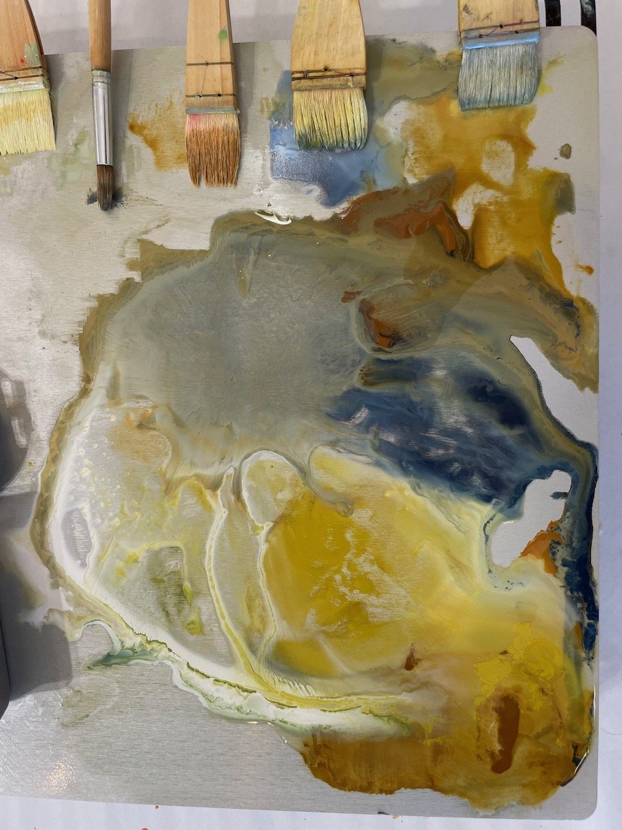
Not all encaustic set-ups are alike. I learned to paint on a hot palette without individual tins. The paints simply melt into each other and create other yummy colors almost automatically. Personally, I wouldn’t want it any other way.
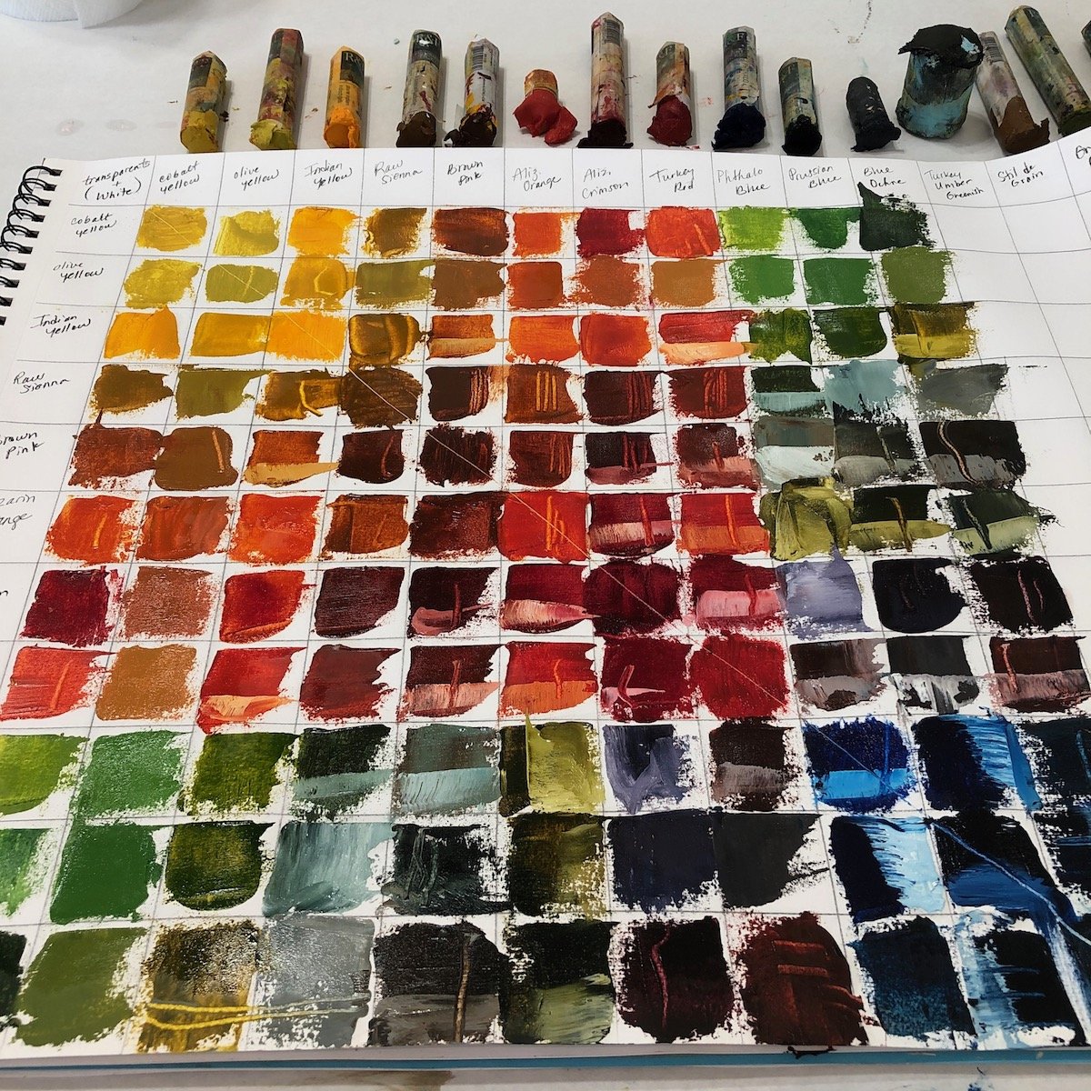
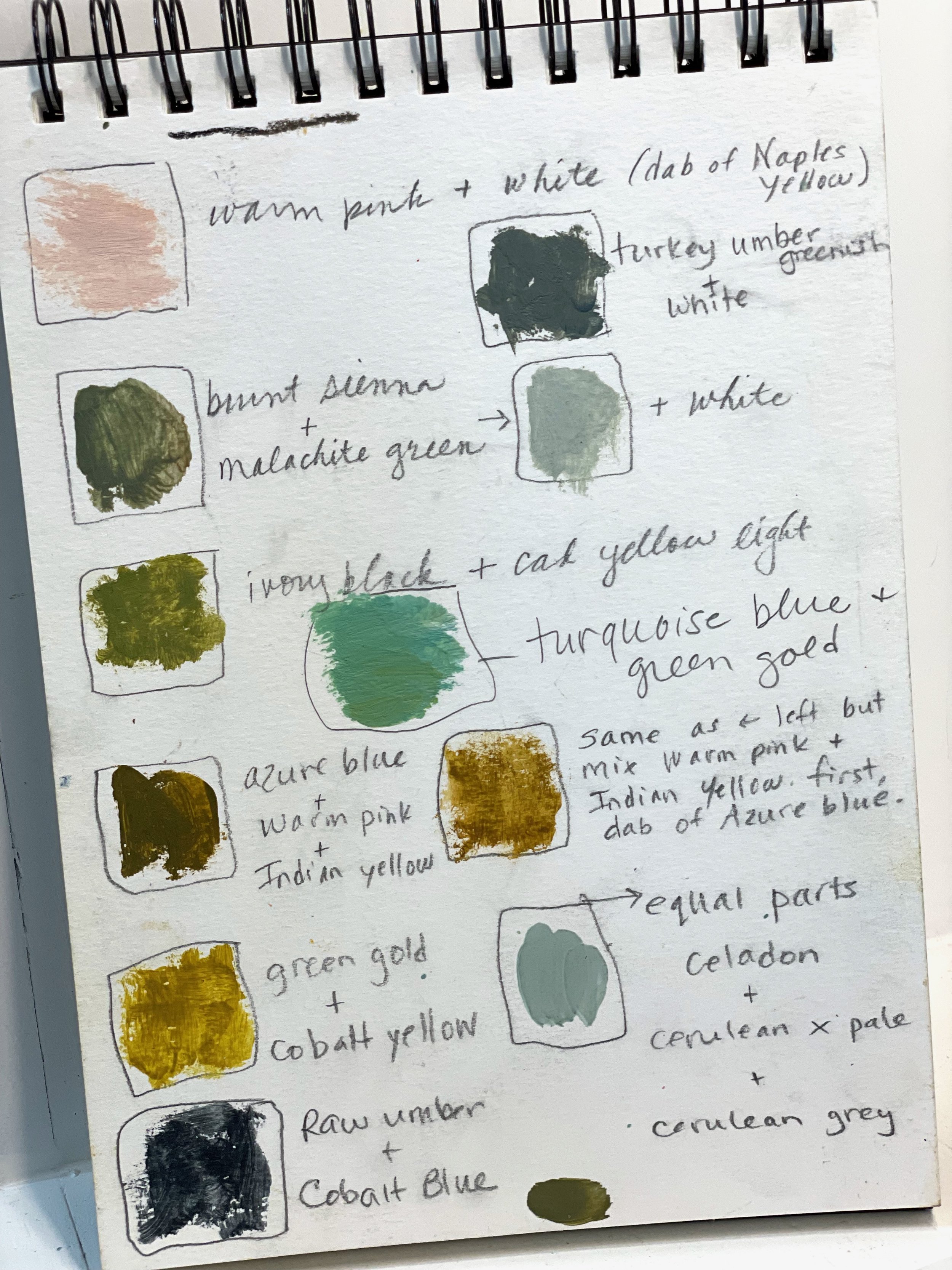
R&F has a wide variety of beautiful colors to work with. I enjoy experimenting with color palettes using either encaustic or Pigment Sticks®. Keeping a chart of possibilities and a record of favorites helps me a great deal, and is so much easier to refer to than reinventing the wheel each time. “How did I make that color again?”
Some of Julie’s color mixing notes.
Two of my favorite limited palettes are shown below. Each limited palette has only three ‘parent’ colors (listed) plus Titanium White. Mixing the ‘parents’ in different proportions will yield dozens of harmonious ‘offspring’ colors. If you’re unsure about mixing colors, this is a great way to start.
Blue Ochre, Alizarin Orange, and Olive Yellow.
Payne’s Grey, Cadmium Red Medium, Cadmium Yellow Light.
My “go to” colors are blues and grey greens; off-yellows, and greyed pinks. I love neutrals and whites. I prefer colors that are higher in value (lighter), lower in intensity (less saturated, greyed versions). I have tried working with darker, bolder, and more intense colors, but I usually end up painting over them. I may, however, use a surprising color as an accent.
The more you paint, you more you get to know yourself.
Julie Snidle, Vessel, 6” x 9”, encaustic on panel.
Julie will be teaching “Authentic Abstracts”- a Pigment Stick workshop designed to help you express your true self at the Eastern Shore Art Center in Fairhope, Alabama July 20-23, 2023.
She will also be offering a 5-day workshop “Encaustic and Mixed Media” at Touchstone Center for Crafts in Farmington, PA August 7 - 11, 2023.
To view Julie’s complete upcoming schedule and subscribe to her newsletter, visit juliesnidle.com.
